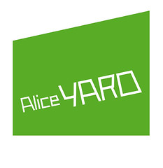
This is truly a combination mark, as it is a convergence of many significant elements.
The green 'BOX' (floor plan of actual gallery space) which formed part of the previous identity,the new word mark which is designed using the new typeface 'Alice SC' which I designed.
For those of you who are familiar with the yard, you would know that when you enter the gate the space starts small and opens up wider towards the annex, that actually determined the scale between 'Alice' and 'YARD' in the word mark.
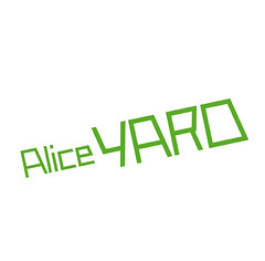
Another interesting thing I discovered while doing research, the angle of the west & east walls of the property is 11.94 degrees and that's actually the angle the word mark is set. The mark is used in two variations, word mark only or combination mark.
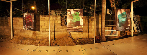
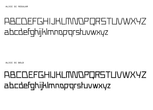
The new typeface was used in three new posters designed to celebrate the 3rd anniversary of Alice YARD. As part of the staging of the event Architect Sean Leonard designed and installed a truly magnificent white ramp. The typeface was installed on the ramp so as you walked up you read from A-Z allcaps and A-Z lowercase.
Many thanks to Sean Leonard, Christopher Cozier and Nicholas Laughlin